
In our competitive world of business, a distinctive brand identity can set a company apart and pave the way for success. Today, we’re excited to share the captivating tale of our FOURTH-GENERATION business owner who, with the help of a marketing firm, revamped their brand to stand out in a crowded market. In this post, we’ll delve into the fascinating discovery of the BLUE COW and how this extraordinary creature became the emblem of our exceptional service.
When the owner Mark Porter embarked on the rebranding journey, he sought the expertise of Orbit Marketing, a leading marketing firm. Together, they scrutinized the core offerings of the business and pinpointed what set us apart from our rivals. To strengthen the brand image, the marketing team proposed integrating a spokesperson, a toy, and an animal mascot into the rebranding.
Choosing the spokesperson was a no-brainer – the owner himself, Mark Porter. As for the toy, the previously used iconic trucks of the business were transformed into miniature versions. The animal mascot, however, was a tougher decision. Initially, the team mulled over a cow, given the company’s Idaho roots, but Mark didn’t resonate with the idea.
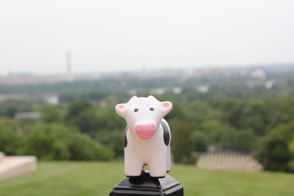
A photo of one of our Blue Cow stress plushie. In 2017 we had a contest encouraging people to take photos of Blue Cow all over the US. This was taken in Washington D.C.
The breakthrough occurred when the team reflected on the business’s unique offerings – the inclusion of the Jersey Butter Toffee Cow candies. These unique candies were placed with each individual order to signify that the delivery came from Porters’ Office Products. Our delightful treats were so favorable that customers would even call if they didn’t receive their “cows.” The connection was undeniable, and the cow became the symbol of our unparalleled service.
To further set us apart, we opted for a BLUE cow – an atypical and exceptional hue for a cow, signifying our unwavering commitment to delivering extraordinary, one-of-a-kind service to our clients. And so, the “BLUE COW OFFICE PRODUCTS” was BORN.
The blue cow logo underwent a few transformations before reaching its final design. Initially, the cow’s face replaced the “P” in the company’s name. Ultimately, the cow’s face became the primary logo, accompanied by the company name and founding year, underscoring their long-standing dedication to quality and service.

Old logo
Current logo
The blue cow epitomizes the distinctiveness of the brand and the exceptional experience we aim to deliver to our clients. It has evolved into a conversation starter, piquing people’s interest in the tale behind the blue cow.
The inspiring rebranding journey of our fourth-generation business owner Mark underscores the significance of a unique and memorable brand identity. By embracing the blue cow, we have not only set ourselves apart from our competition but have also laid a robust foundation for ongoing prosperity.